Californian
Loose shirts, washed neutrals, and late-afternoon gold make this look feel expensive without looking overworked.

New York
New York wants cleaner edges, stronger black-and-white contrast, and one controlled statement that holds up against the city grid.
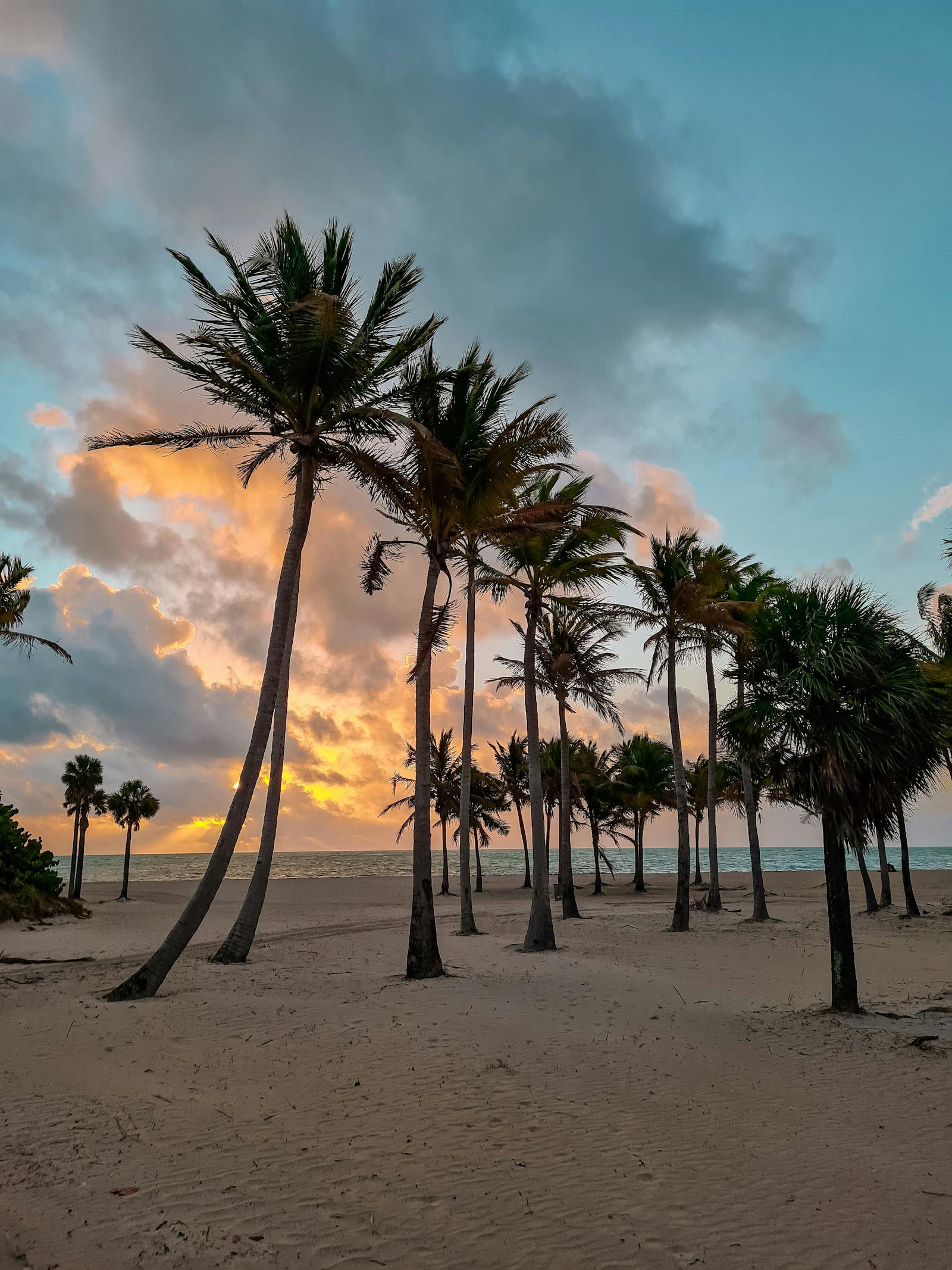
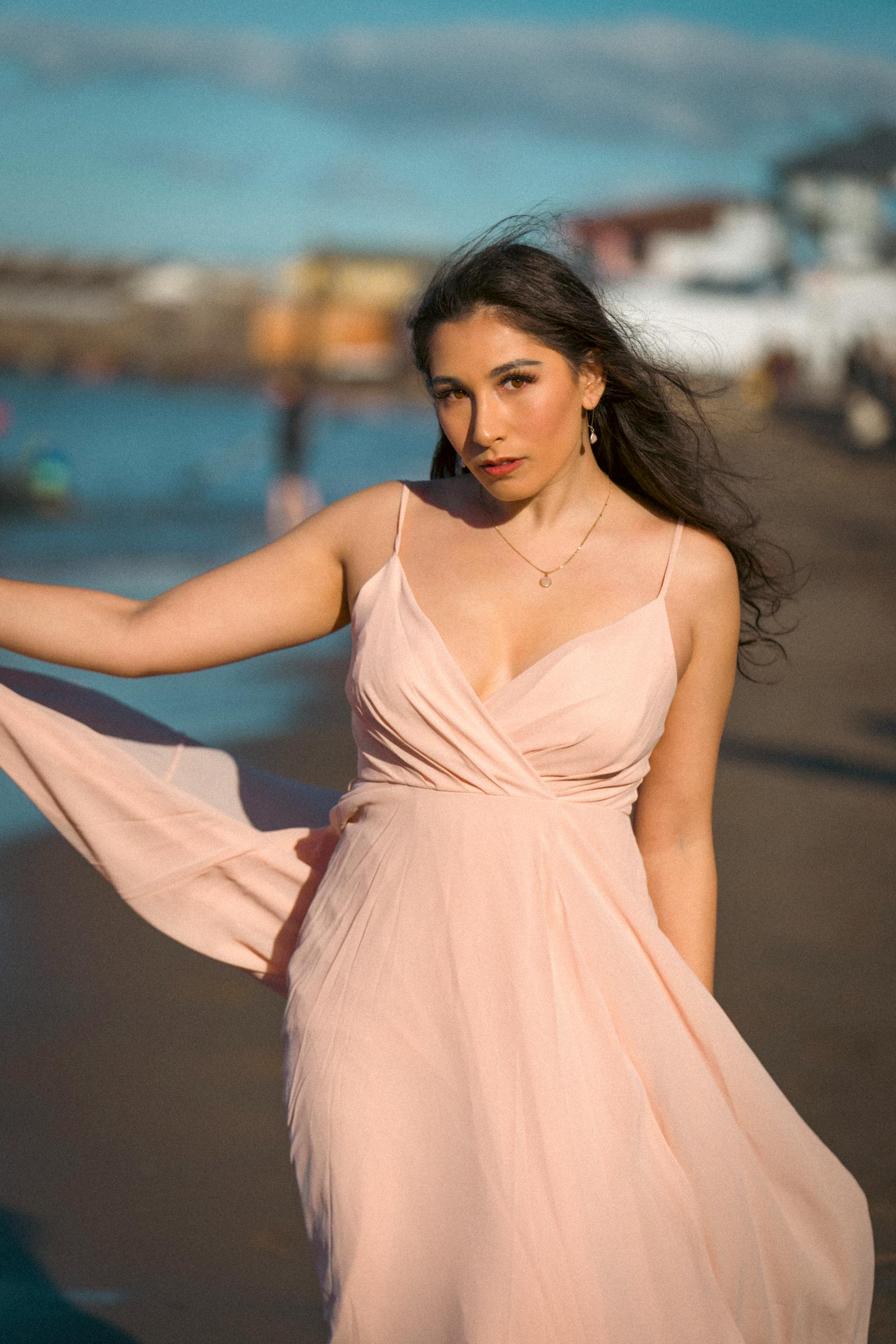
Florida
Florida thrives on aqua, coral, sunset orange, and the sort of high-humidity glamour that makes resortwear feel alive.
How the page is staged
The story moves from matte and sun-bleached to hard-edged city structure and then into tropical saturation. That sequencing makes the U.S. section feel broad instead of repetitive.
California sand
New York black
Florida aqua
Sunset orange
Why this belongs in the journal
- It gives the journal more personality and more obvious visual hooks.
- It broadens the editorial voice from calm product writing into stronger style curation.
- It adds images that do more immediate emotional work.